
100 Deadliest Plane Crashes in History
2014 / Collaboration with Hye-jung Yeom & Sang-ah Ko
An interactive 3D scatterplot of the top 100 worst plane crashes in history, implemented in Processing. The (3D) scatterplot method was chosen for effective multivariate visualization and analysis. It allowed us to represent the myriad factors that characterize each plane crash - airline, type, cause, flight phase, number of occupants, region, etc. - within each individual data point, and visually investigate its patterns, distribution, and relationship or correlation between variables in one comprehensive plot. The 3D view and camera flythrough allows us to see the overall pattern as well as the individual data points and its characteristics. Users may click on each point to zoom in for a close-up view, zoom out to visually compare multiple points, or double-click on an icon for a detailed view of the selected accident, including a pop-up view of a location map, related pictures, and a textual description.


Visual Mapping Approach
X: year (1950~2013), Y: fatalities (0~520), Z: age of aircraft (0~40 yrs)
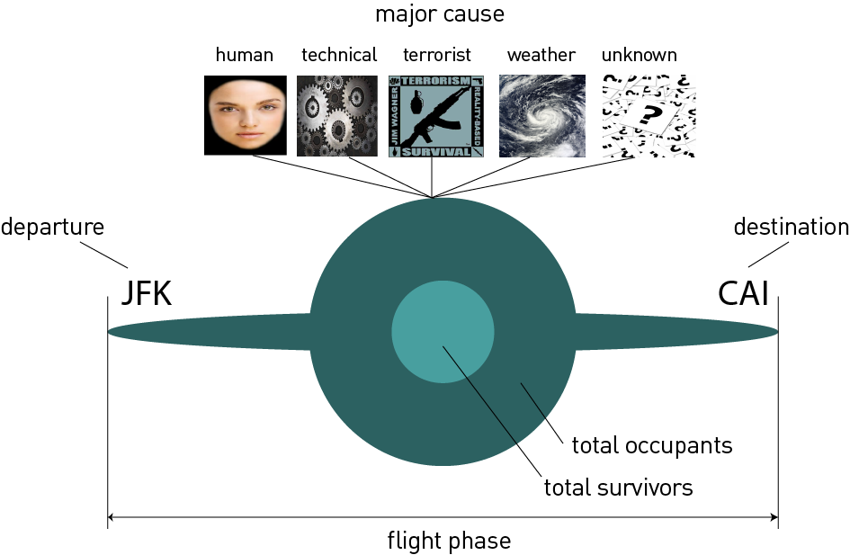
Plane volume = total occupants
Bright volume = total survivors
Plane wing length = flight phase (TXI-TOF-ICL-ENR-APR-LDG)
Plane wing text (left to right end) = departure airport (left) ~ arrival airport (right)
Major cause (of accident): mapped image (human, technical failure, terrorism act, weather, other)
Detailed Information
Rank, date, time, location, operator, aircraft type, manufacture date, flight type, schedule, flight phase, fatality ratio, major cause etc.
Interaction
Mouse interaction: click and drag for 3D virtual cam flythrough, zoom in and out, double click data point for detailed view
Keyboard interaction: toggle 'c' to view major cause, and 'p' to see the airports set for departure and arrival
Sources: Bureau of Aircraft Accidents Archives, Aviation Safety Network


